
Why Packaging Colour Matters
Much has been made of the association of particular colours with brands, from Twitter’s bright blue to Facebook’s navy and McDonalds’s iconic yellow arches – but how important is it to get colour right when it comes to packaging and branding?
According to one study , as many as 90% of snap judgements about products are based on colour alone, and almost 85% of consumers say colour is the primary reason they buy a particular product. 80% also believe that colour increases brand recognition.
But which colours are the right ones when it comes to making an impression? The answer changes based on the brand itself.
When it comes to fast food brands, yellow is a popular choice – we already mentioned the famous McDonalds arches, but McDonalds has plenty of competition from Burger King, KFC and Pizza Hut, who all also make use of yellow in their branding. According to Tufts University, yellow is an appetite stimulant, making it the perfect choice for food packaging and branding.
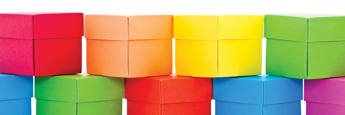
However, yellow isn’t always the right choice, with a colour preference and assignment study showing that the most unpopular colours with both men and women were orange, yellow and brown. Purple was also unpopular with men, disliked by a quarter of all respondents (compared to only 8% of women).
With many consumers able to recognise brands from colour alone, according to surveys by the likes of Reboot, it’s essential to get those colours right.
We’re ISO 12647-certified, which means that we take colour consistency seriously. No matter what material we’re printing on, we take the utmost care to make sure the colours are true to branding, and consistent across your entire range.